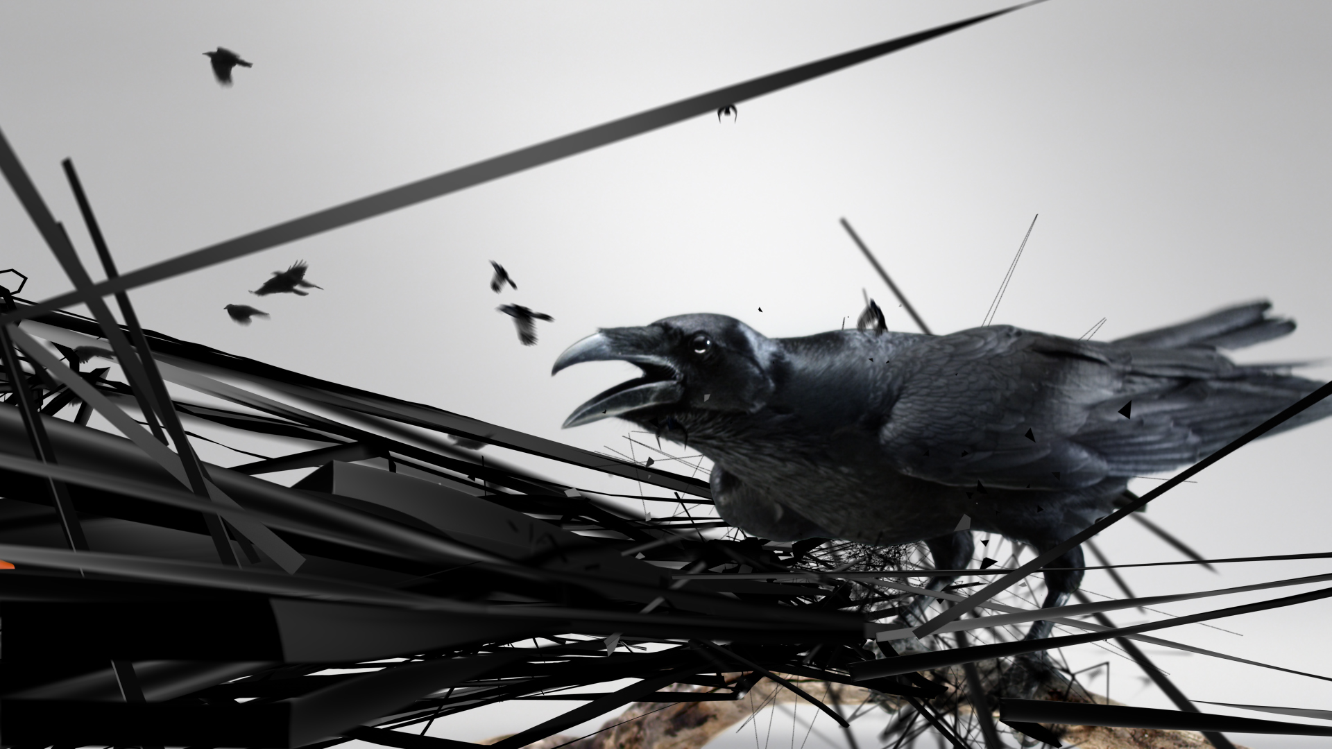
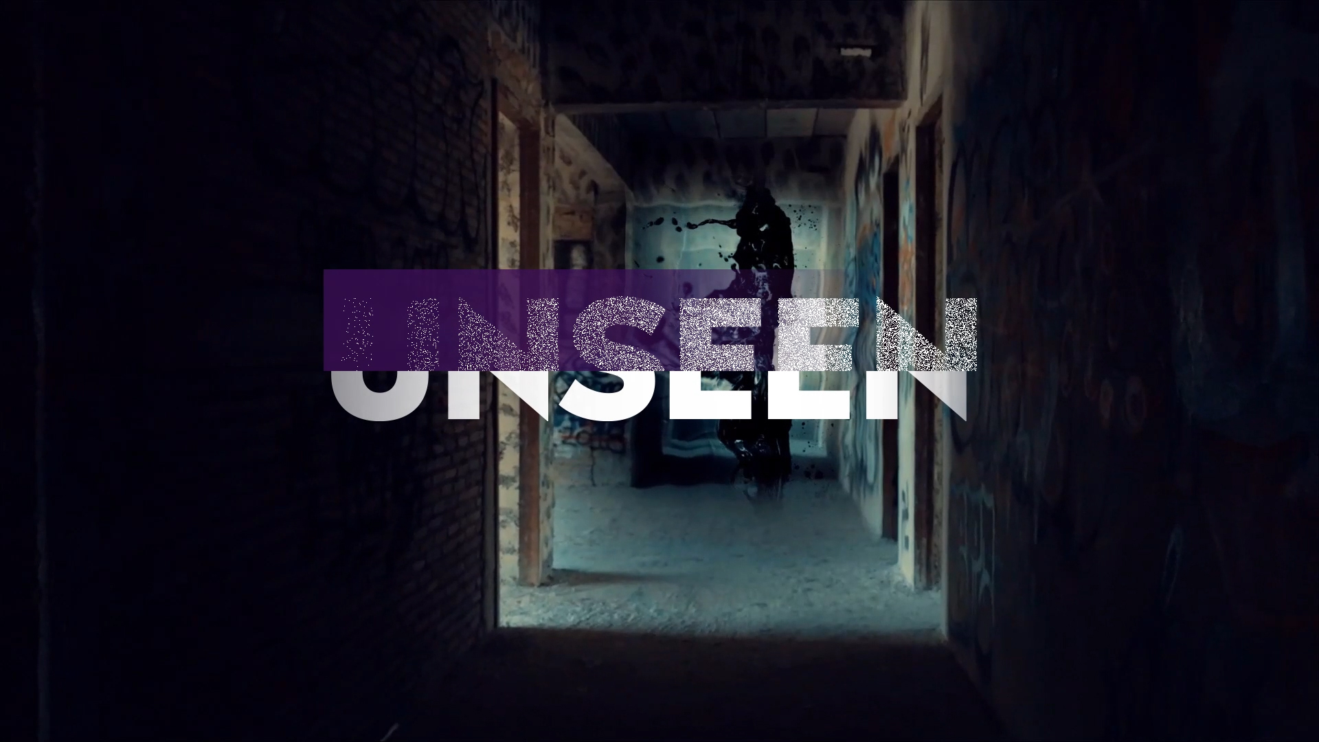
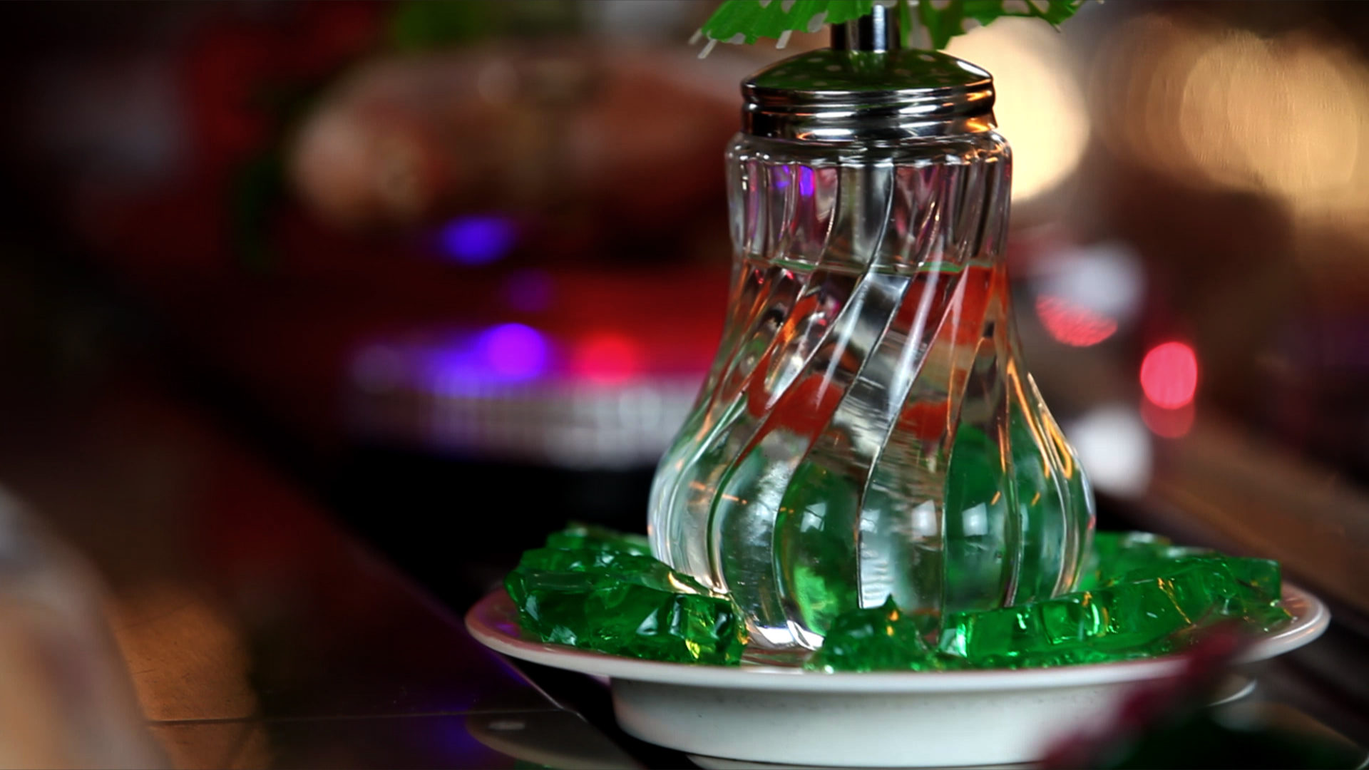
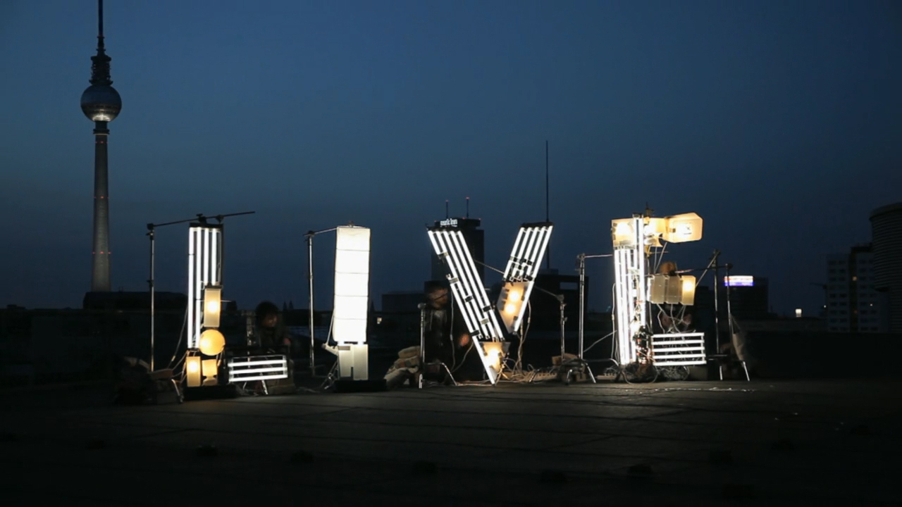
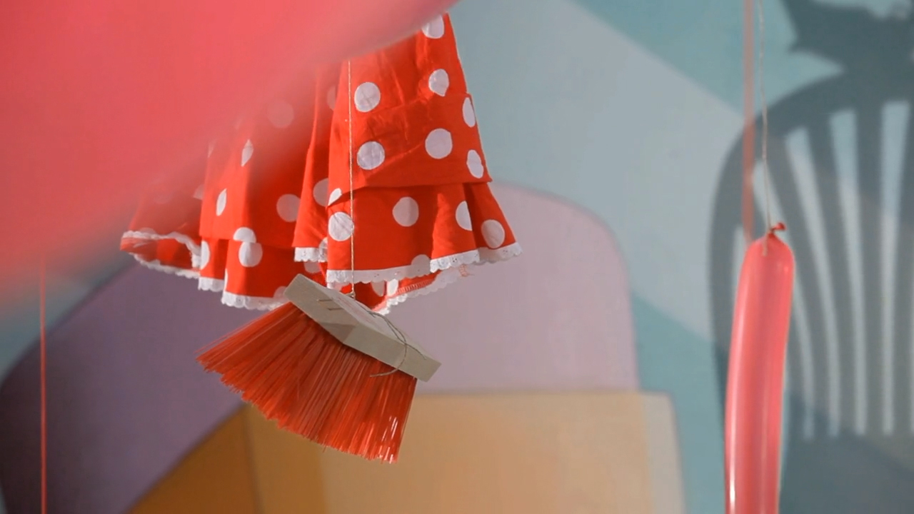
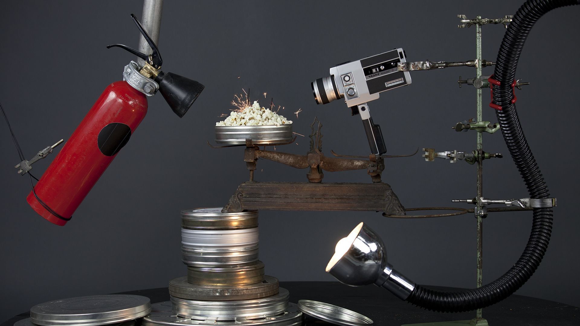
TVN Channel Branding
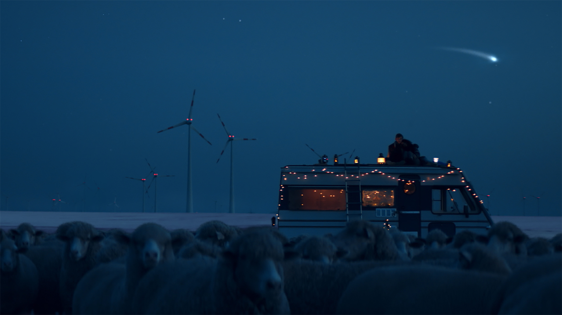
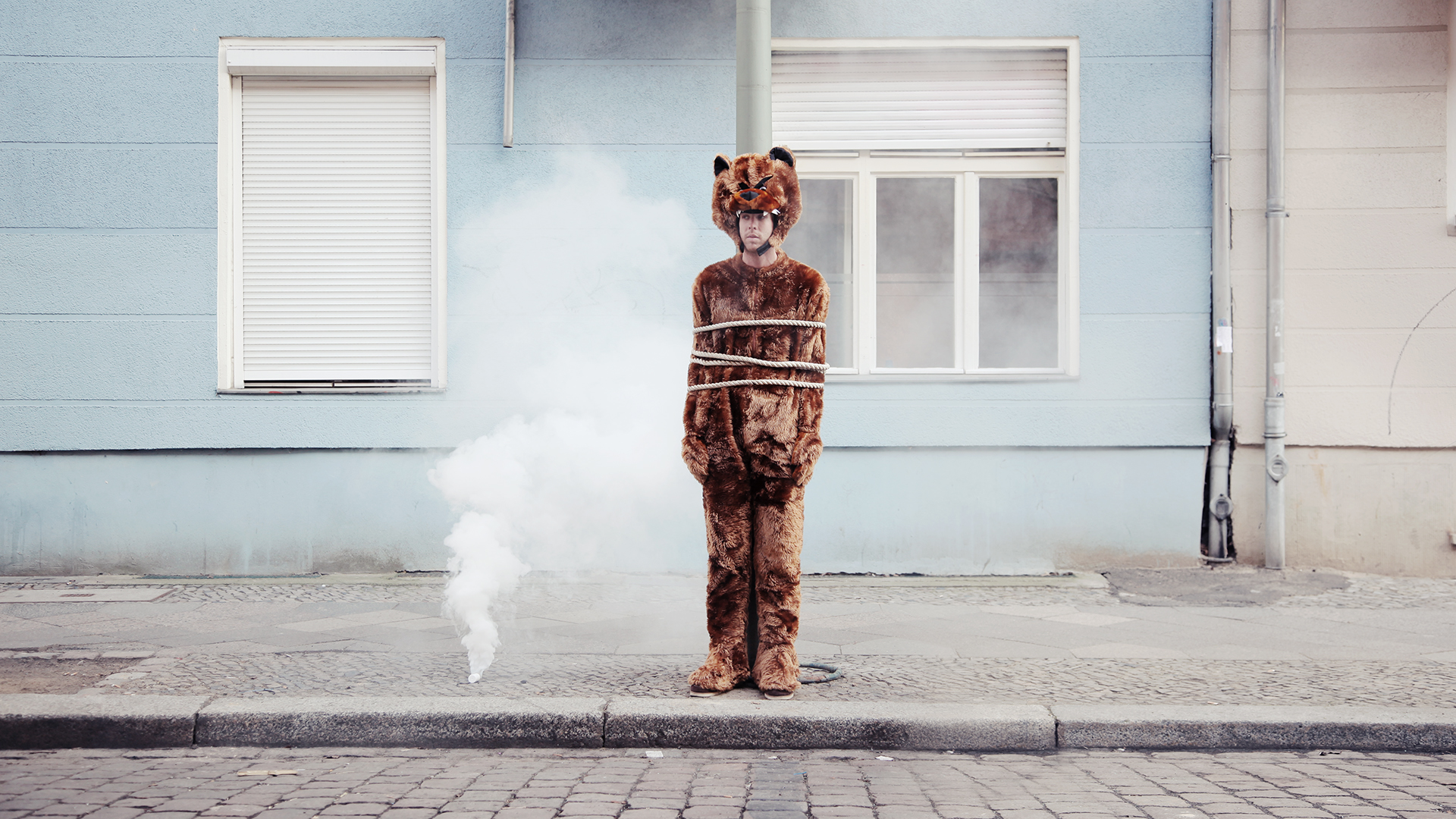
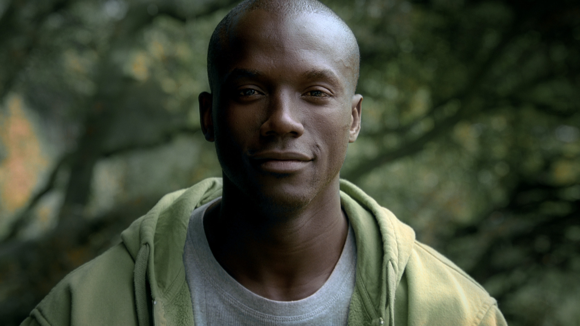
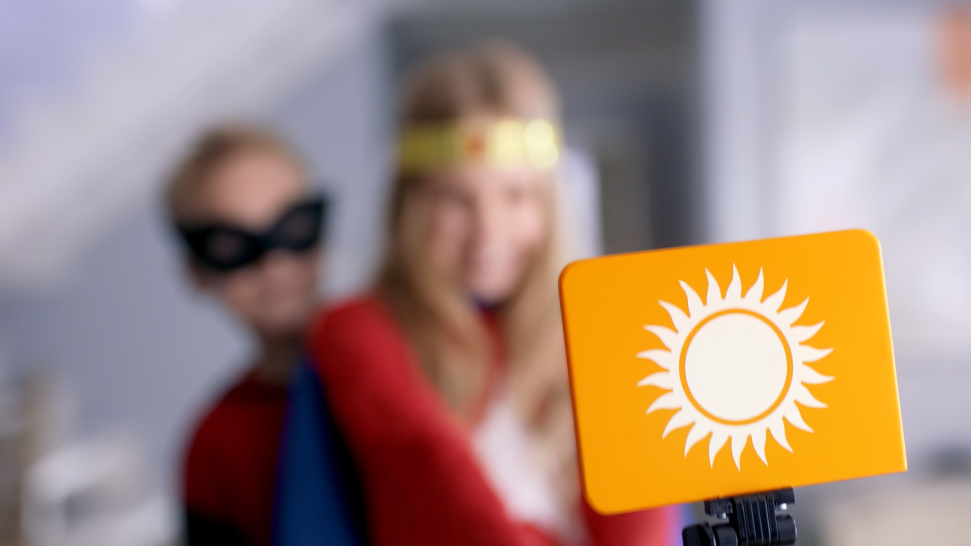
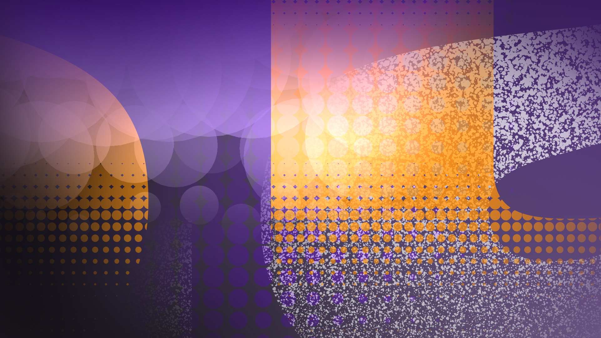
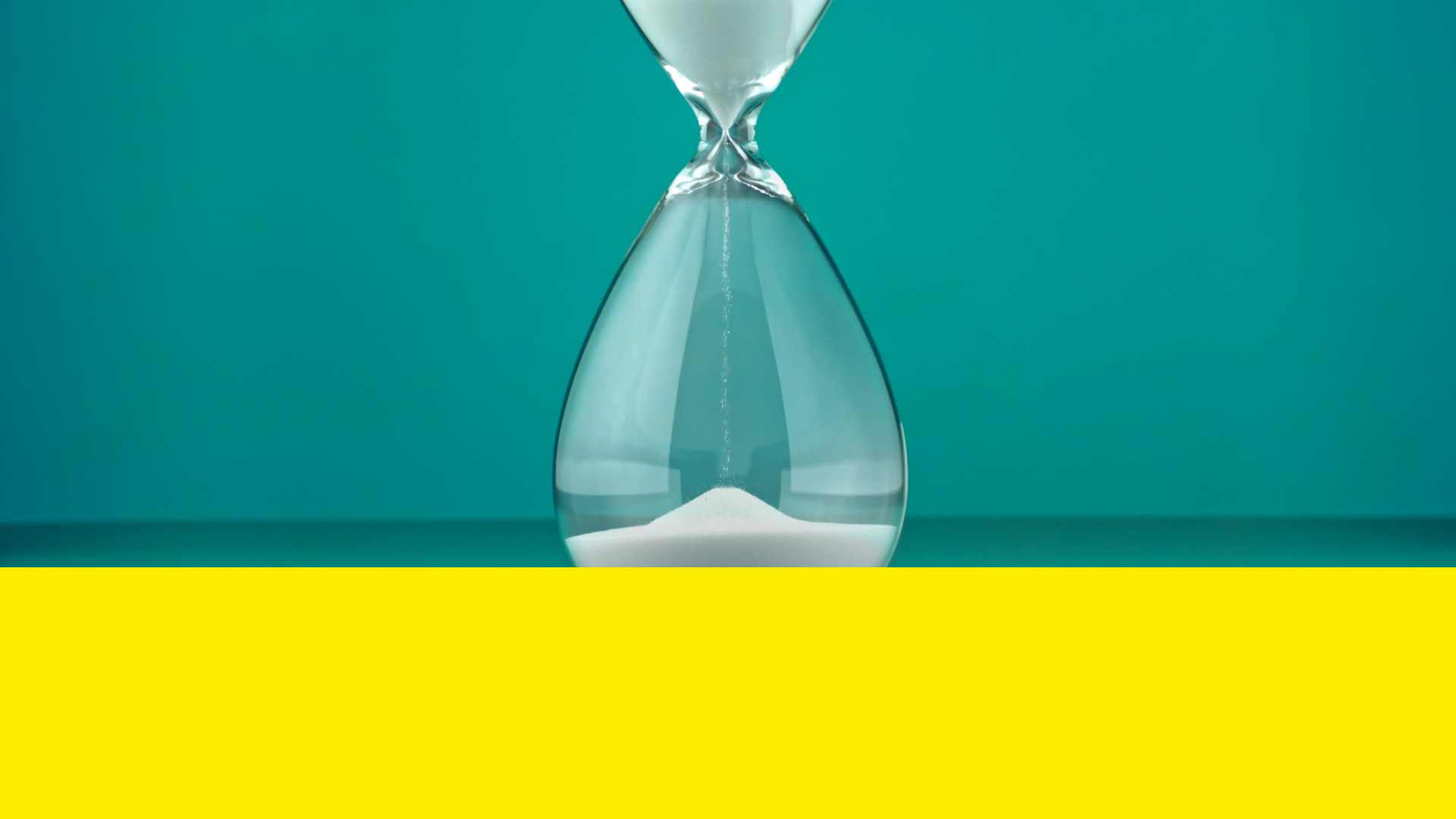
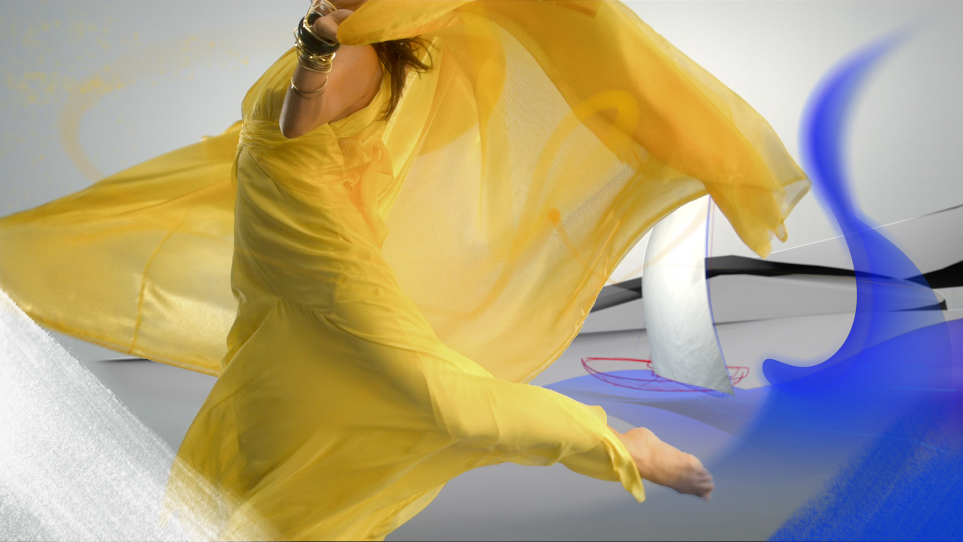
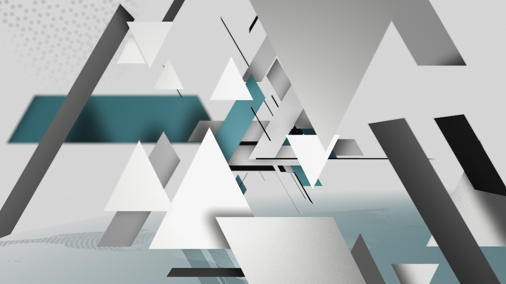
TVN has been already a well known brand in the European and Polish market. The clear, recognisable identity and the logo with its distinctive colour combination of blue and yellow has kept the role of the channel for modernity and high quality for many years. The challenge for the redesign of tvn was to keep this identity and at the same time to advance it in a new era. As the logo is so strong and established, we decided to put it even more into the center. The new design of TVN is focussing on the essence – the logo. We call the concept: Reduced to the Maximum. The design language concentrates exclusively to the shape of the circle. While reducing all other design elements, the circle is put in the focus of attention. It stands out as a striking element; it serves as an eye-catcher and a platform for all informations. The design does without additional shapes to emphasize the distinct profile of the branding. In the indents the logo gets a personality. The idents discover the potential of TVN. The logo gets depth and space and becomes alive and a character. Everything ends up in the circle of the logo. Various figures transform into a circle and end up in the logo. Their shapes can be diverse, a fan, a bunch of balls, a toy, etc., even a cube ends up in a circle, everything is possible. The figures turn around their axes, they are initiating the logo and are representing the new design. The idents are carrying humorous interpretations of the channel and entertain the viewer.