Redesign
The last redesign of the ARD logo was in 2003, a long period in which a great deal has happened technically. The goal was therefore to further develop the logo in order to modernize the ARD brand with regard to the Internet and new areas of application in a future-oriented manner.
The typeface and logo had to be adapted in terms of readability and size applications, as small-size display is essential. The first and most important step was the selection of a sans serif, straightforward, modern typography to guarantee good readability in small applications. The distinctive shape of the "Eins" was strengthened by new proportions, more space around the "Eins", thinner outline, etc., thus optimizing the figurative mark without losing its recognizability. The aim was also to link the "Eins" and the "ARD" more strongly and, in doing so, to give the figurative mark more visual weight compared to the old logo. In the last step, the ARD lettering was modified by LucasDeGroot as a Thesis font with slight adjustments.
The color scheme was also revised in the new corporate design. The CI blue as the main color was retained, but somewhat brighter and friendlier. In addition, a generous selection of new ARD award colors is available. More choice means more variety for a wide range of topics and applications.
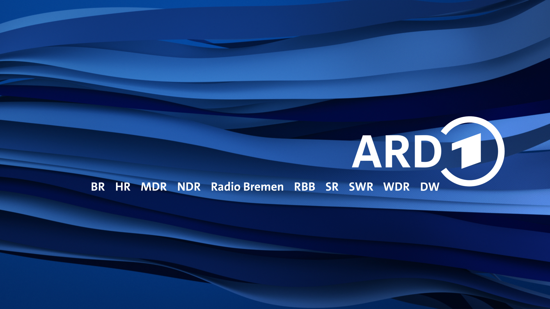
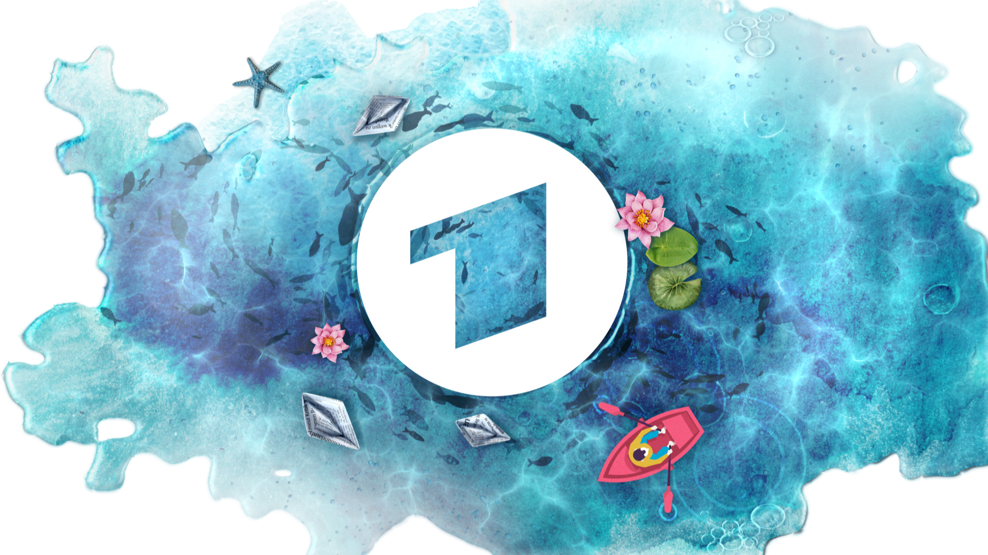
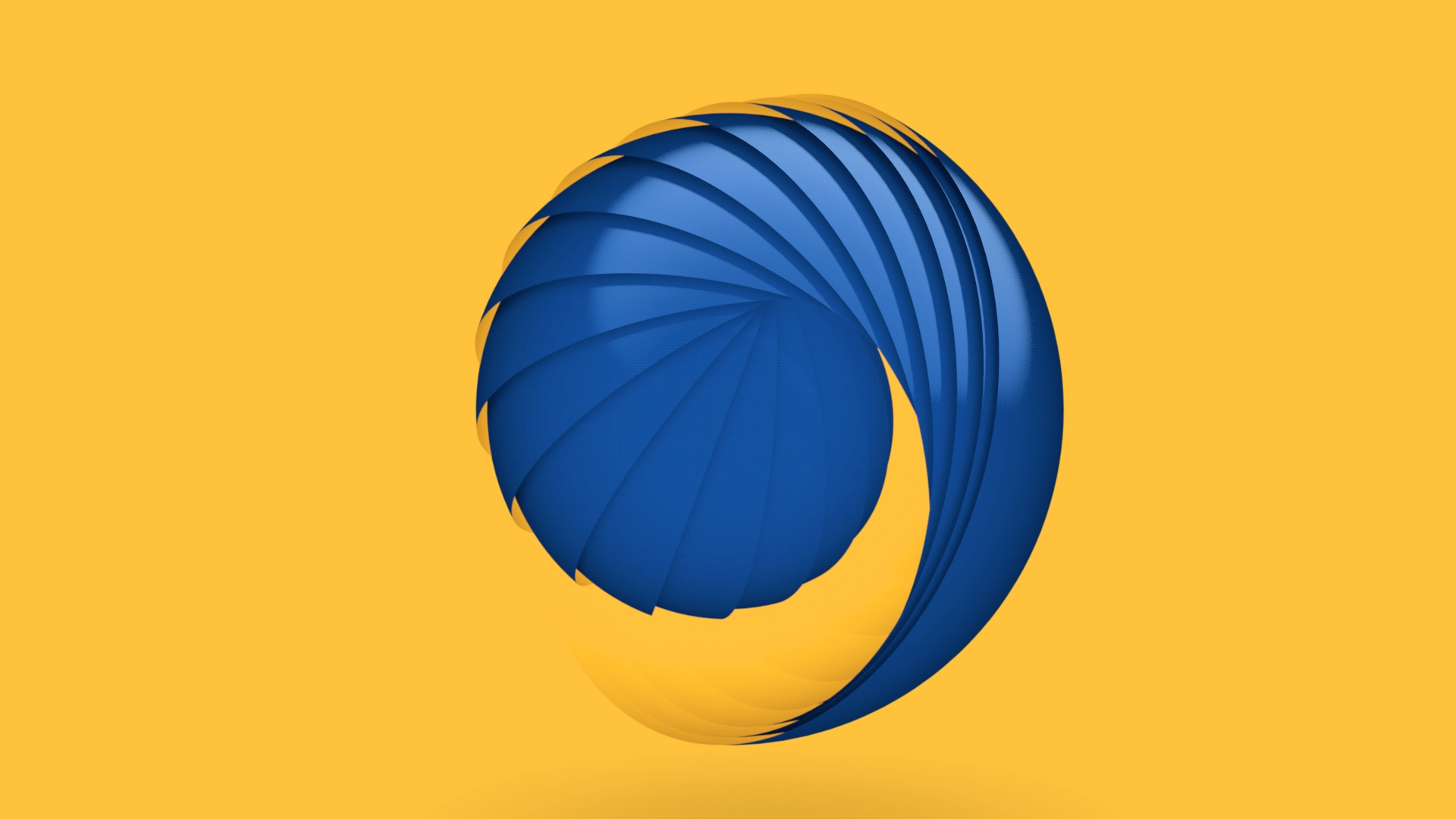
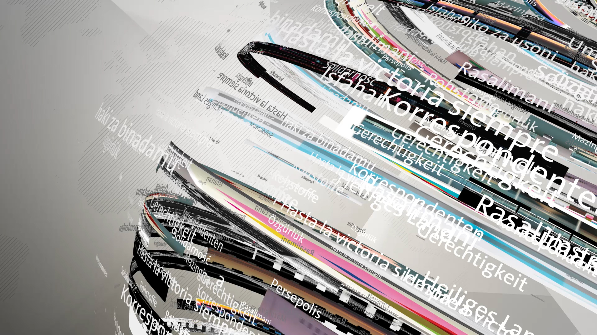
The key visual in the new ARD corporate design is the ARD wave. It describes the ARD community as a multitude of individual strands that, when combined, sound together to form a great whole.
The new ARD logo was created in 2019 in collaboration with ARD Design and Luxlotusliner.


ARD-Wave
The ARD wave as a key visual is used everywhere when ARD as a company or parts of ARD are represented. To ensure stringency in brochures, press folders and corporate presentations, the typography and arrangement of all individual parts follows the principle of the middle. The use of typography in the center set is an important feature in ARD's appearance. The ARD logo is clearly visible in every application and stands for itself and as the sender. Thanks to its strong memorability, it forms a reliable fixed point in the new, multifaceted design.