Polsat Redesign
Polsat unmistakably - and yet completely different.
Polsat, the Polsat Group, and all associated television channels and corporate brands now have a brand new logo. All these brands follow a unified design principle. As a consequence, the clear assignment for the user and the viewer is unambiguous.
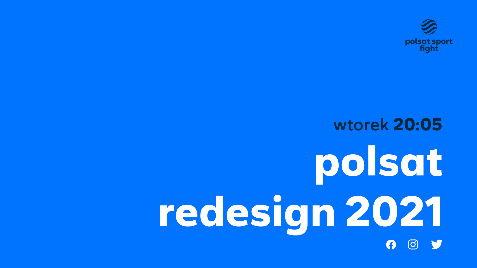
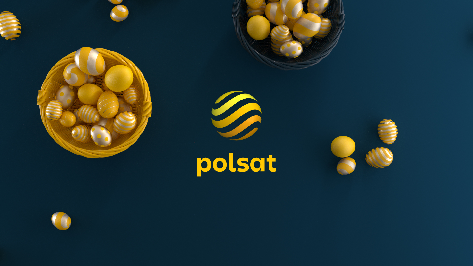
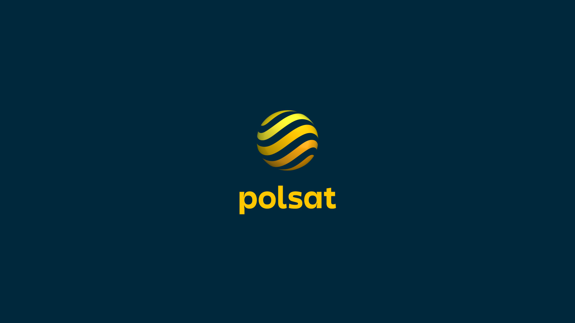
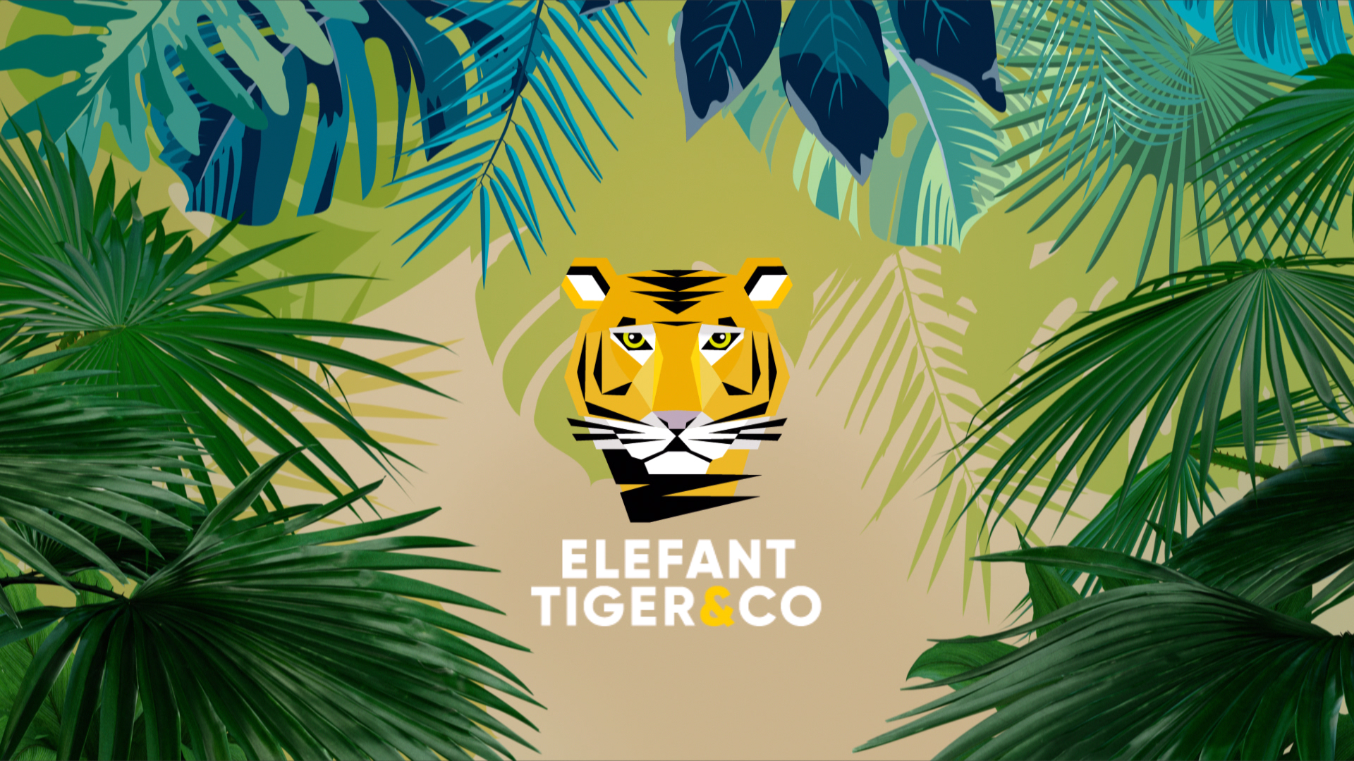
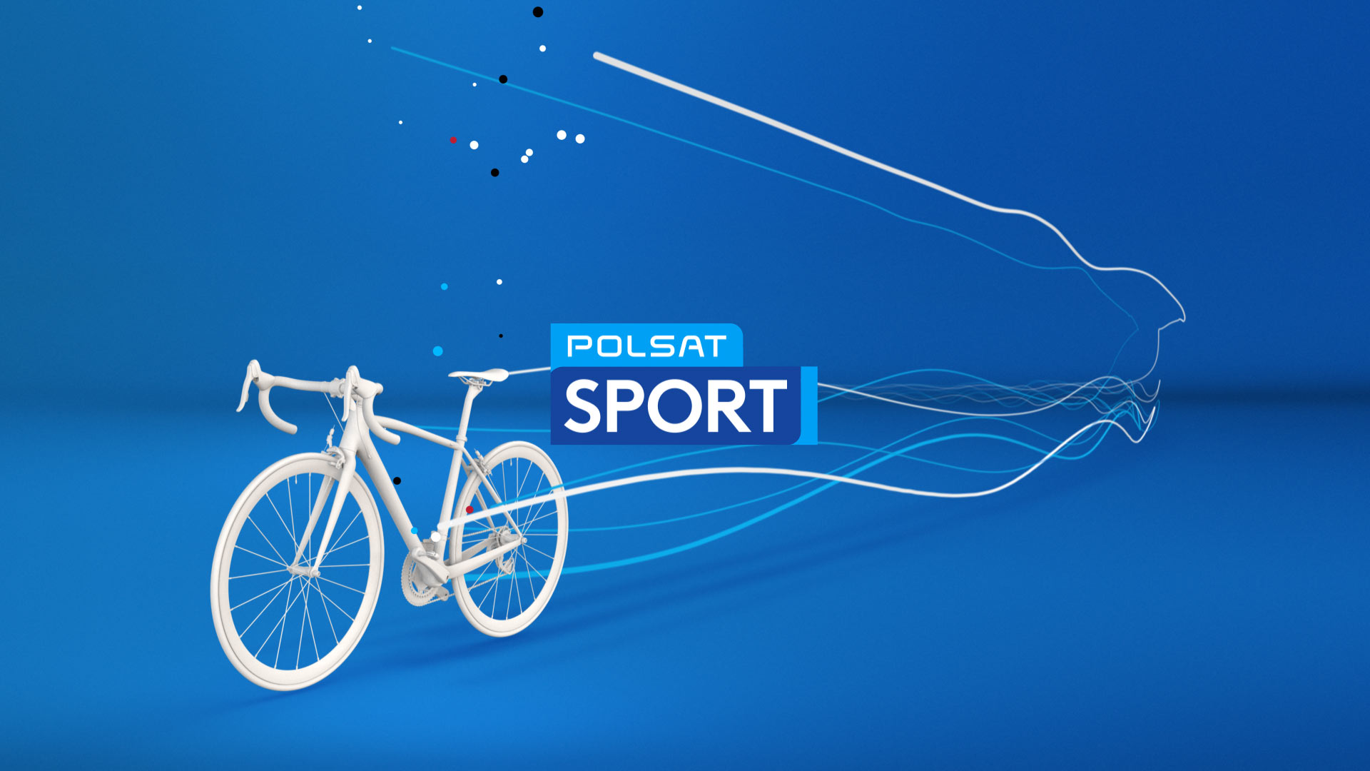
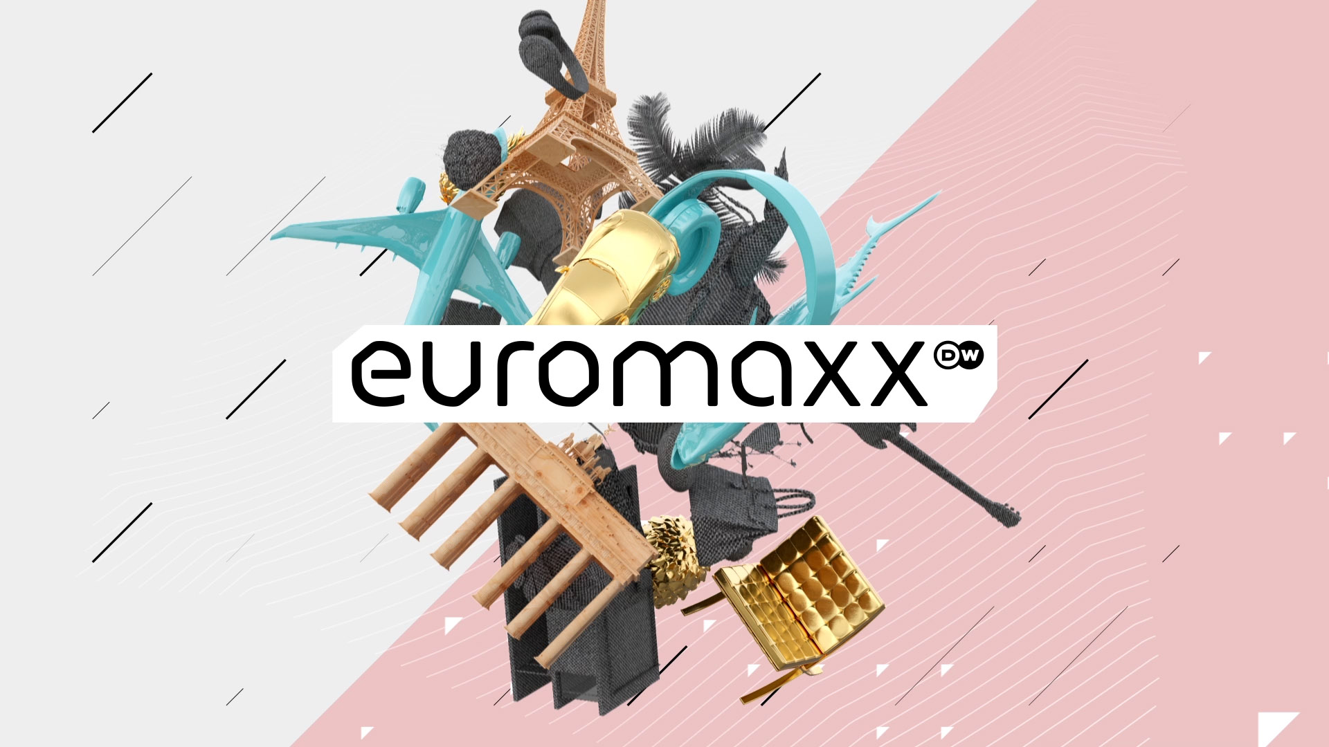
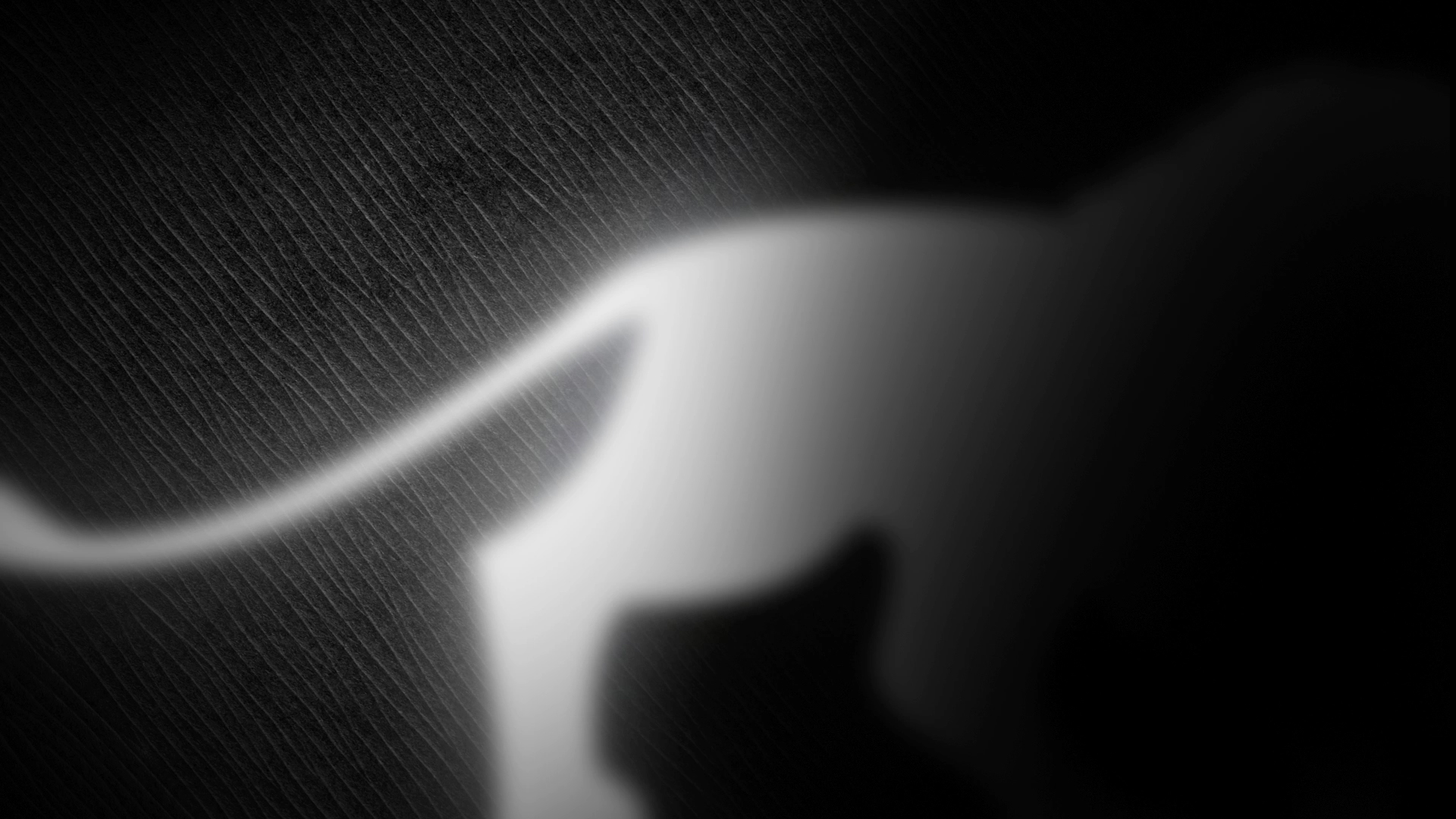
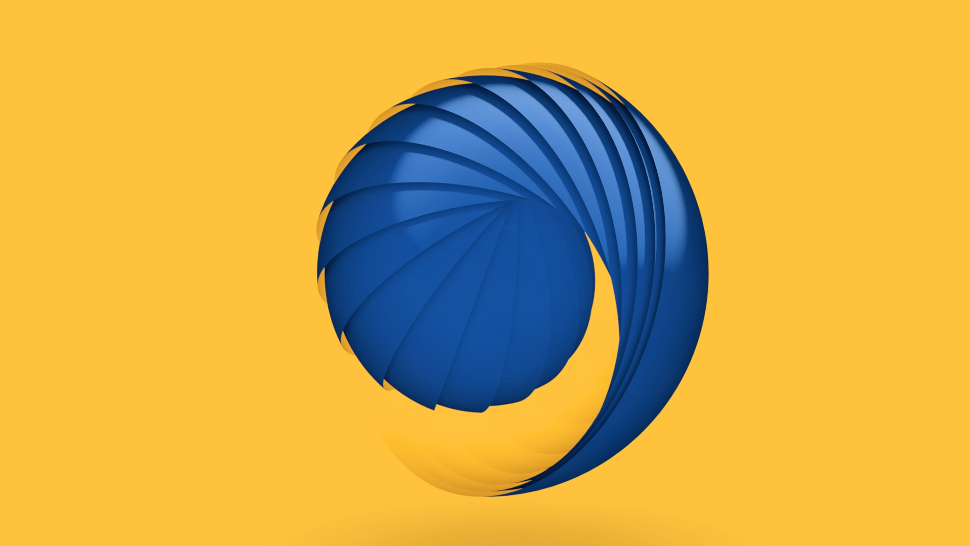
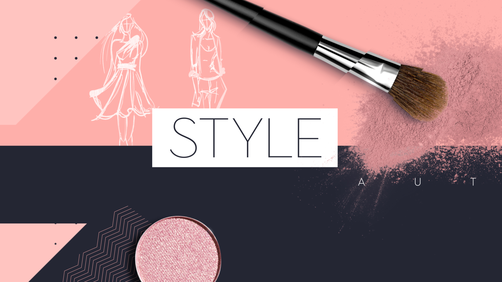
Derived from the previous sun from Polsat TV, radial stripes now form a circle and reveal a new era, a new Polsat era for all Polsat TV channels and all other Polsat brands such as Plus, Box, where the circular shape appears as a connecting element. The skin / texture inside the circle varies, depending on the brand. Every single brand and every TV channel has a main color and its own color palette. The background color is always a dark petrol blue and thus enhances the luminosity of the logos and the design. The logos and typography were developed by Saffron.
Redesigning the logo is a big step for a well-known brand. That is why it needs a skillful staging in the On Air Design as a moving image. That implies a new design that goes hand in hand with the logo. This new on-air design for the TV channels was developed by Luxlotusliner.
The logo bumpers stage the logo spatially and three-dimensionally and give it visual depth.The logo bumpers also have a new sound, composed by the music company Novaspot.
Polsat, the Polsat Group, and all associated television channels and corporate brands now have a brand new logo. All these brands follow a unified design principle. As a consequence, the clear assignment for the user and the viewer is unambiguous.
Derived from the previous sun from Polsat TV, radial stripes now form a circle and reveal a new era, a new Polsat era for all Polsat TV channels and all other Polsat brands such as Plus, Box, where the circular shape appears as a connecting element. The skin / texture inside the circle varies, depending on the brand. Every single brand and every TV channel has a main color and its own color palette. The background color is always a dark petrol blue and thus enhances the luminosity of the logos and the design. The logos and typography were developed by Saffron.
Redesigning the logo is a big step for a well-known brand. That is why it needs a skillful staging in the On Air Design as a moving image. That implies a new design that goes hand in hand with the logo. This new on-air design for the TV channels was developed by Luxlotusliner.
The logo bumpers stage the logo spatially and three-dimensionally and give it visual depth.The logo bumpers also have a new sound, composed by the music company Novaspot.


Design
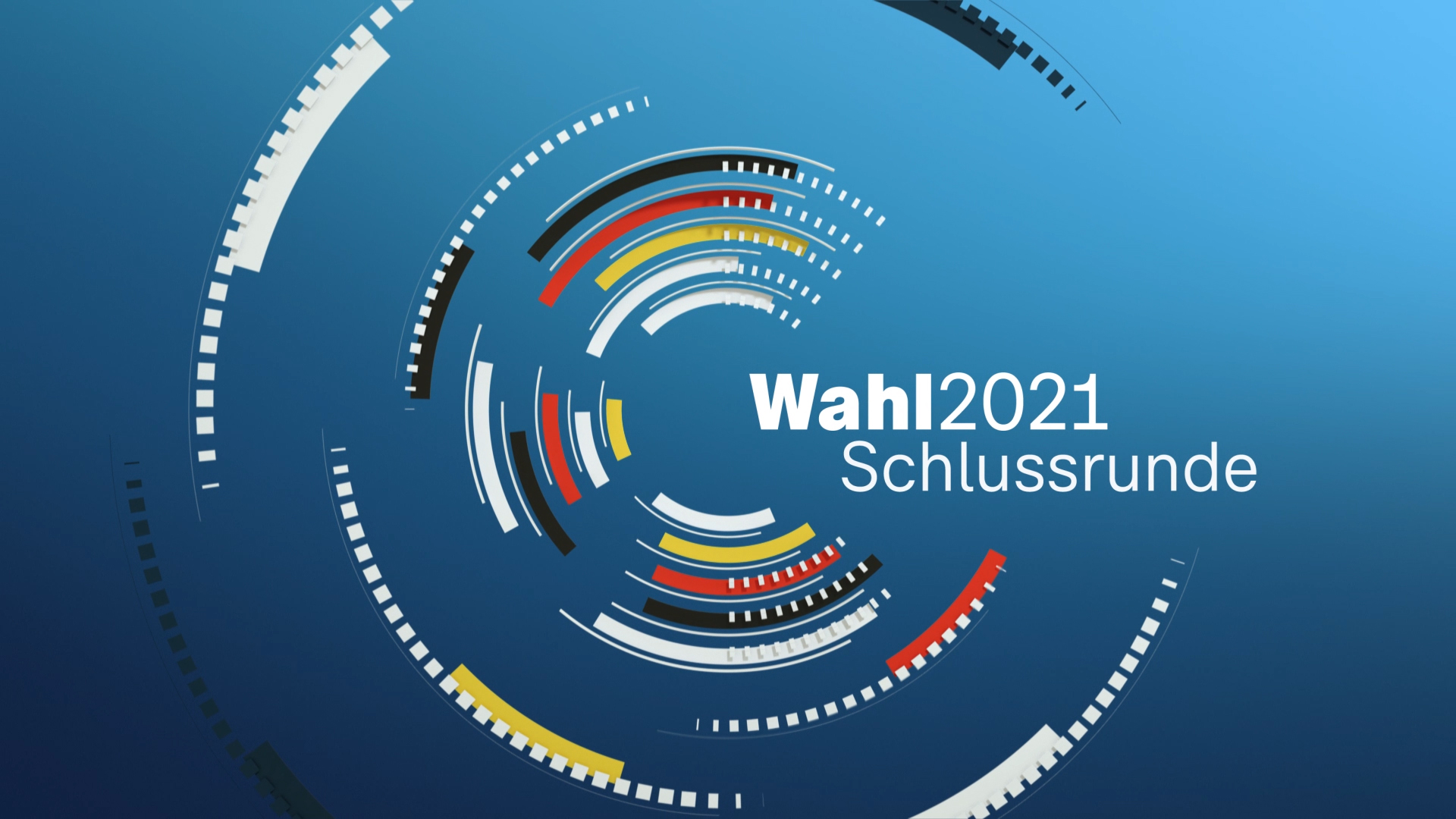
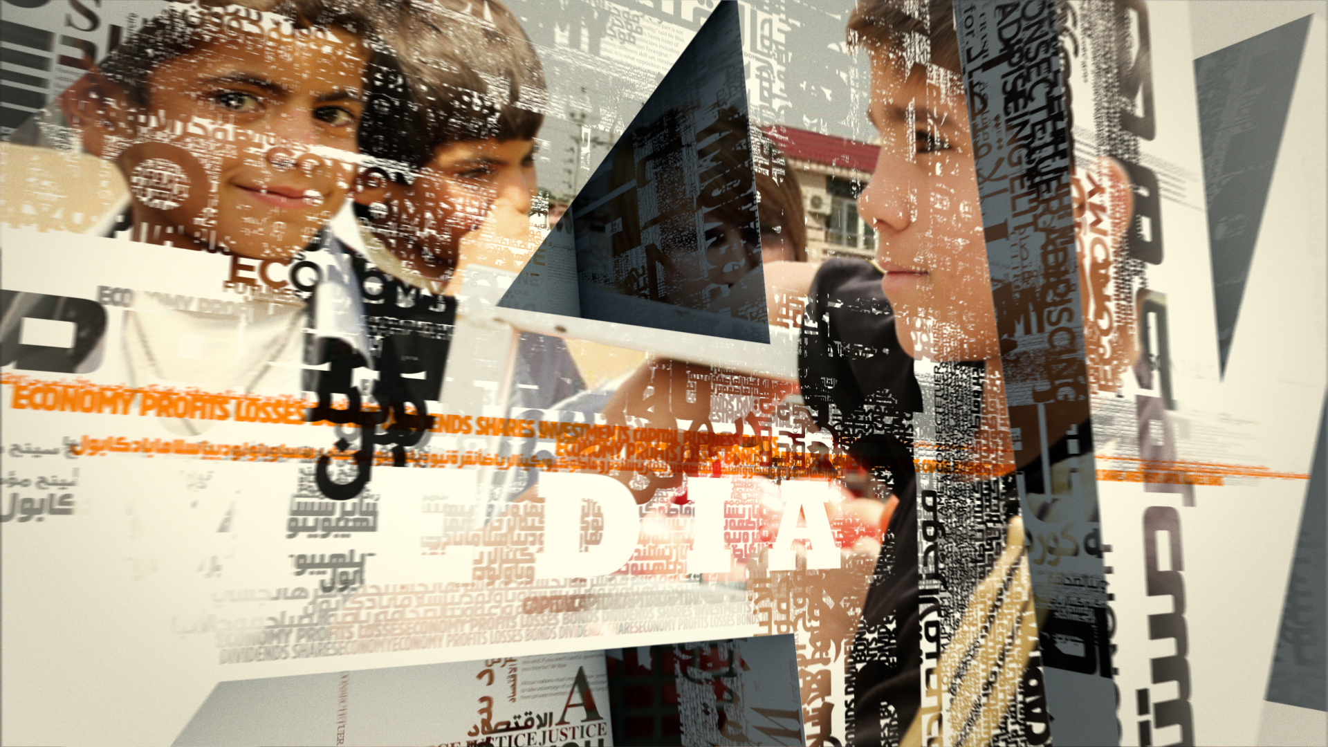
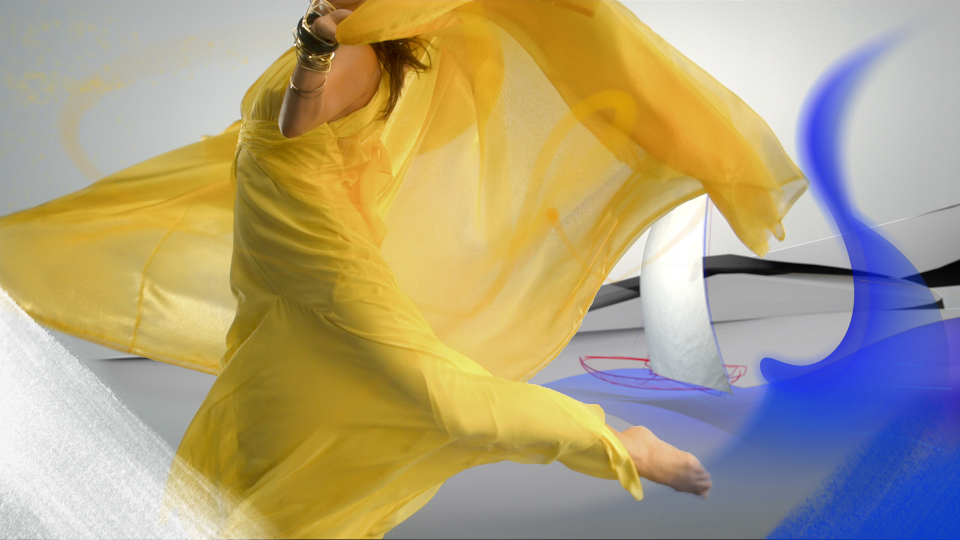
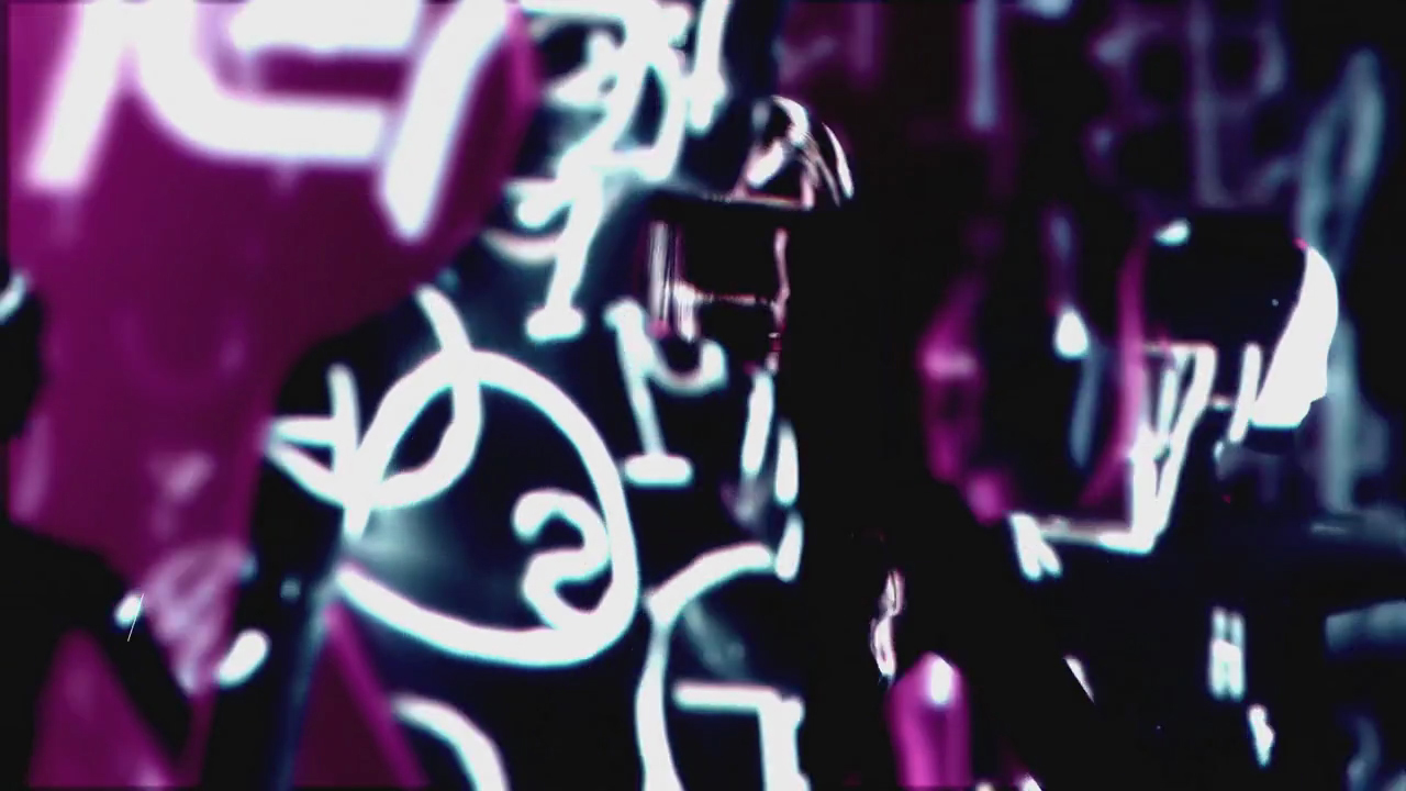
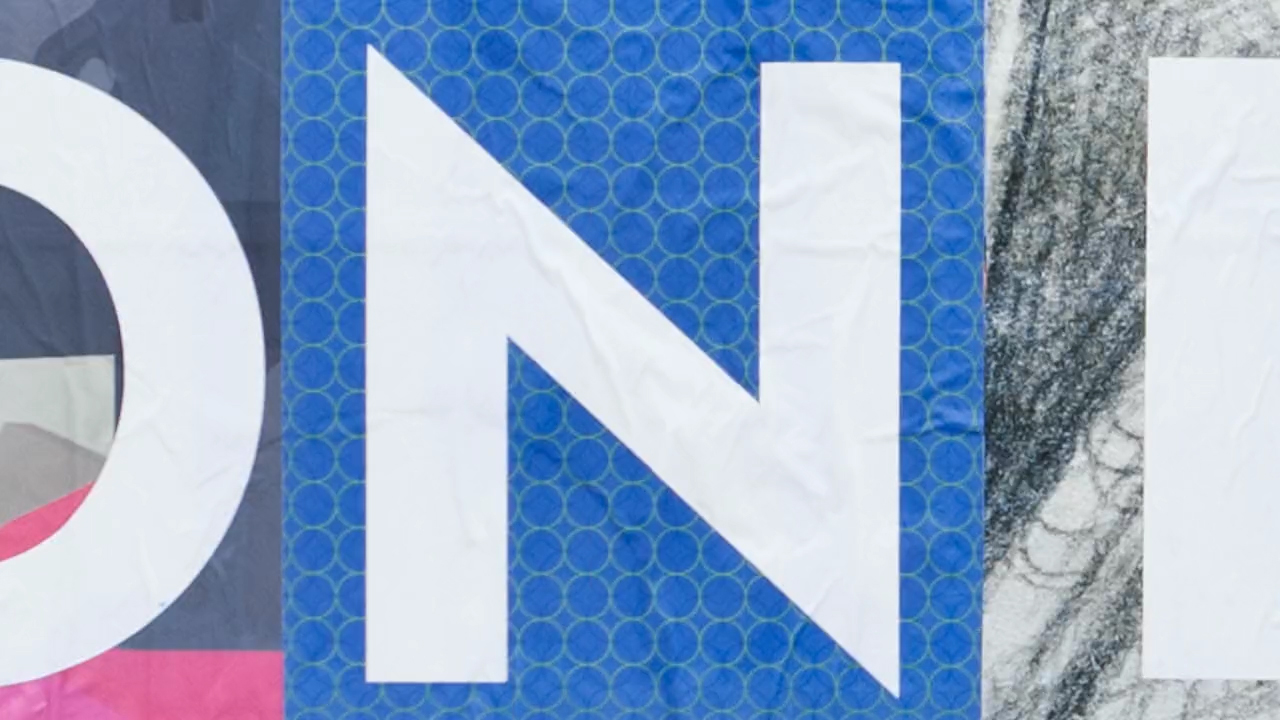
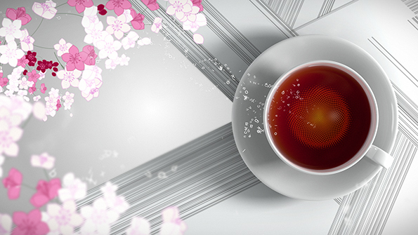
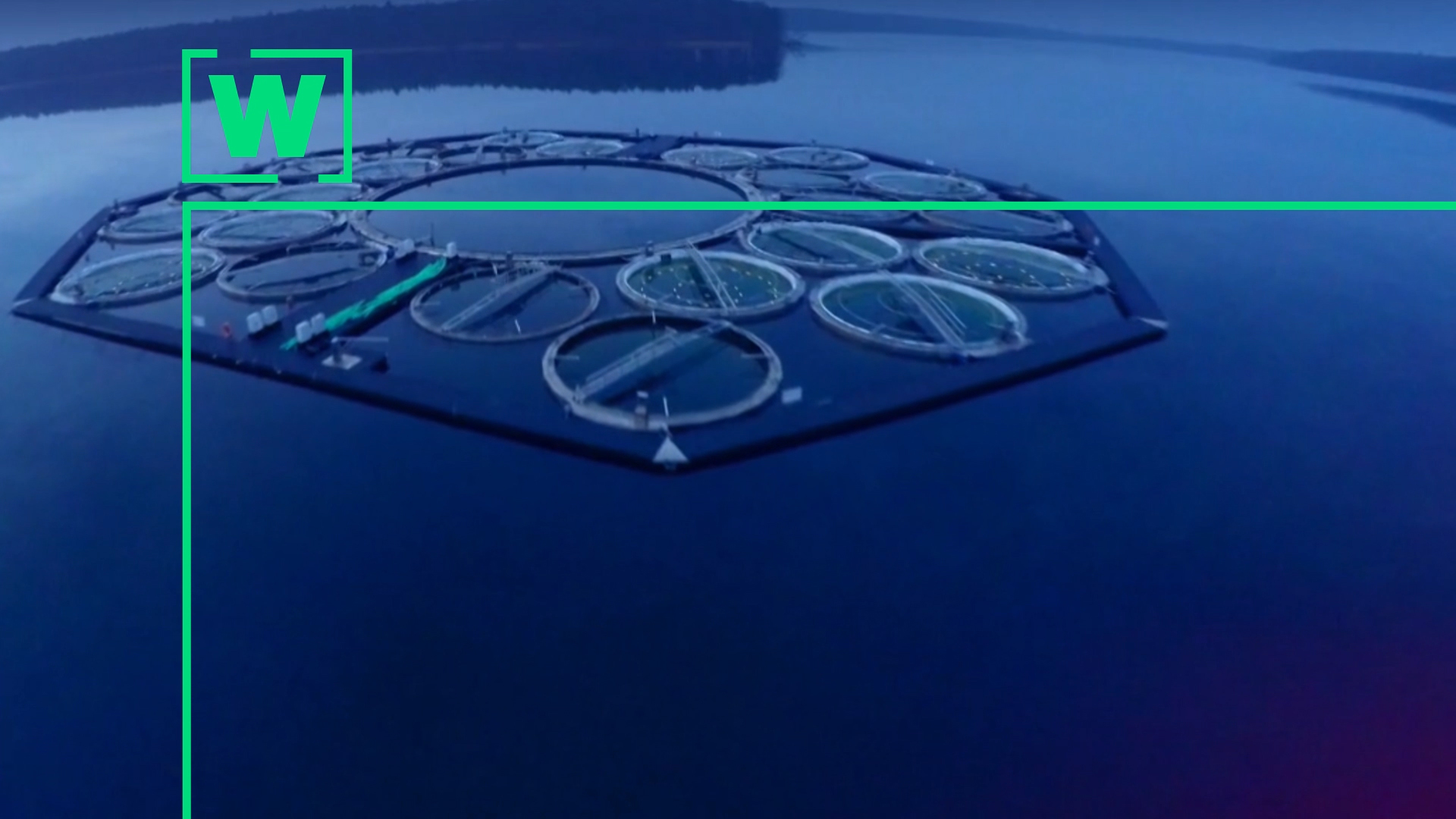
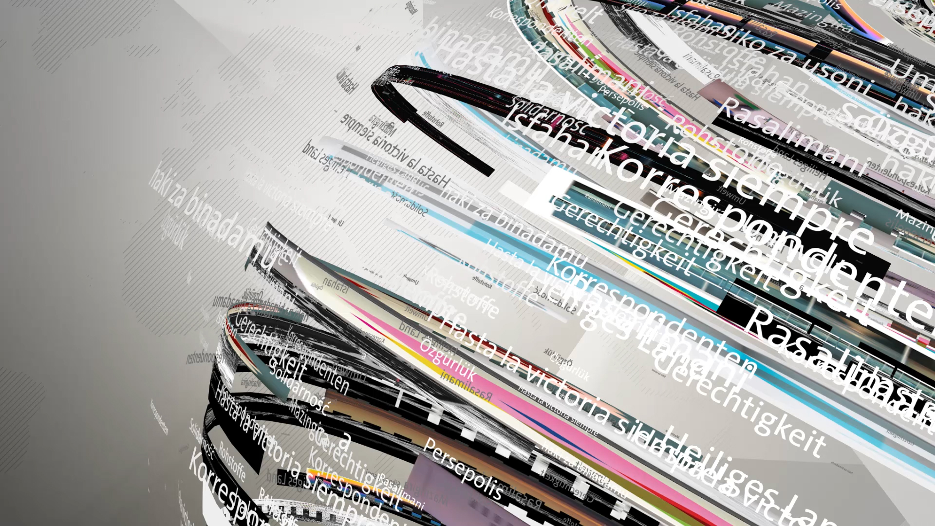
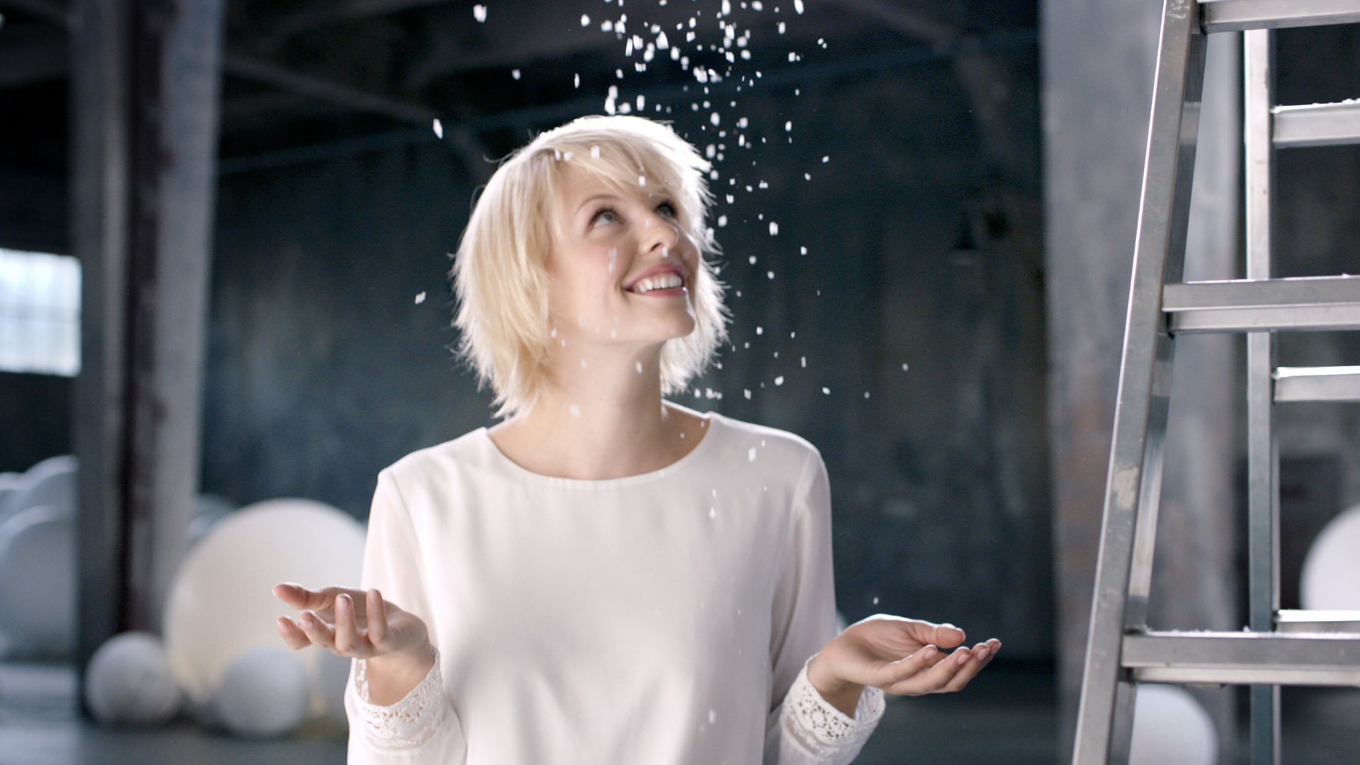
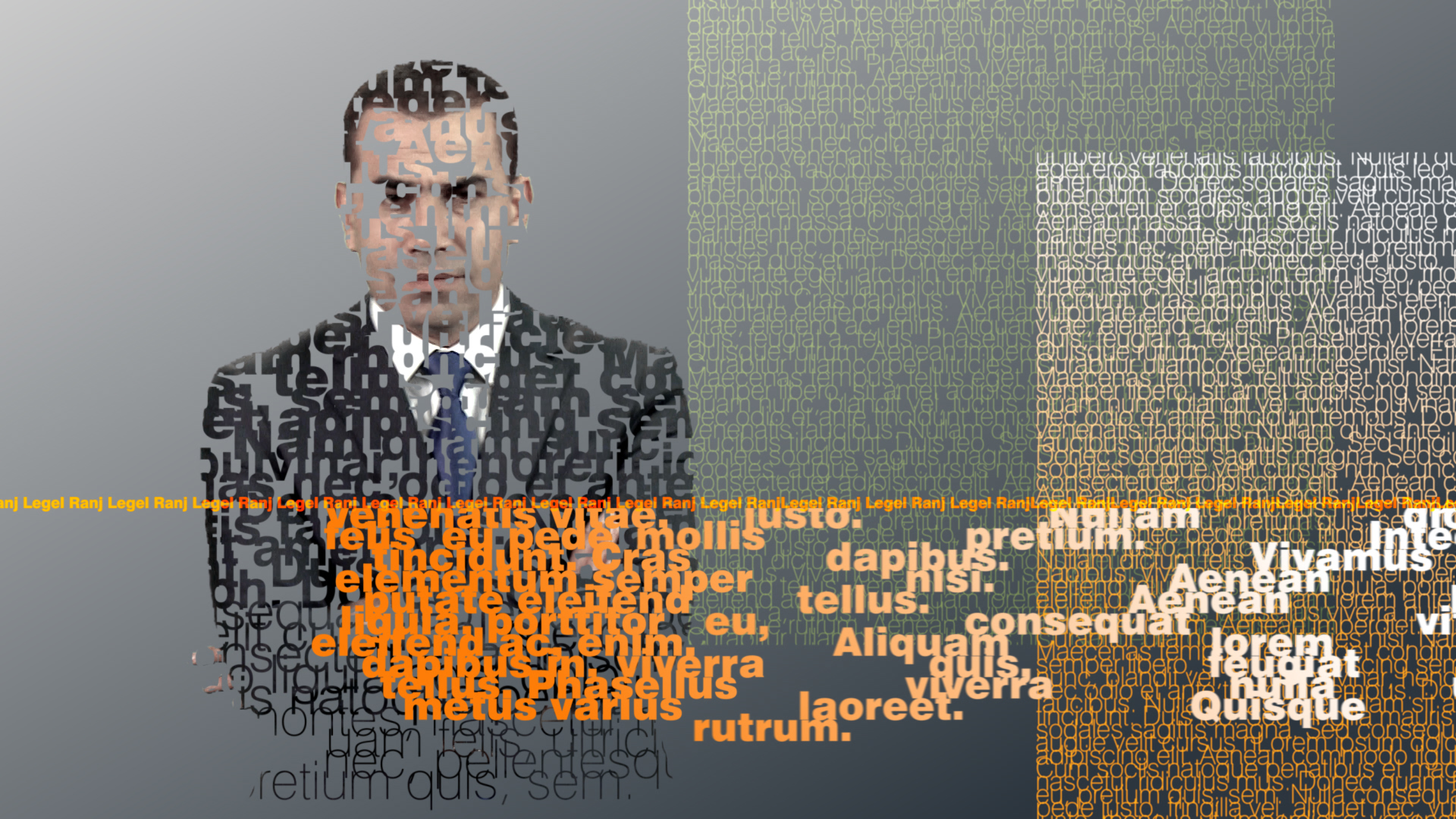
The new on-air design can be used in a multimedia way. The trailer packaging works with bold, large typography specially designed for Polsat. It places the program at the center - content is the hero. The design elements are fluent in their animation language. The skin transitions, which flow into the picture like rays in their movement, give an exciting dynamic and contrast with changing color surfaces. Social media and web notices are linked to program information. In the cross promotion, the respective color worlds are combined and by this they simplify orientation.
The design is colourful and user-friendly, it unites the Polsat Group and gives it a unified overall look.
The new skins / patterns become living textures and promise diverse and further variations for the near future.
The design is colourful and user-friendly, it unites the Polsat Group and gives it a unified overall look.
The new skins / patterns become living textures and promise diverse and further variations for the near future.